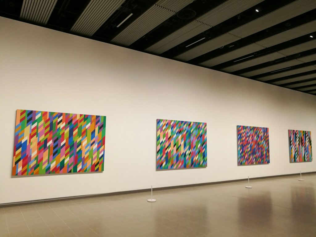
In January I enjoyed the Bridget Riley exhibition at the Hayward Gallery, London://www.southbankcentre.co.uk/venues/hayward-gallery/past-exhibitions/bridget-riley

It was a beautiful winter’s day in London, the clear sky already tinged with pink, and as I walked across the Jubilee Bridge to the Hayward, the Thames sparkled. It is years since I have visited the Hayward, but the Bridget Riley exhibition had to be seen. She has been dubbed the queen of Op art although the artist does not use that term to describe her work, Her paintings are remarkable, and this retrospective allowed the viewer to glimpse her artistic hinterland and enjoy examples of her innovative work since the 60s, including her most recent pieces.
In my own work, I revel in colour. I am interested in colour theory, the shifting impacts of the interaction of colours on the eye, an interest sharpened by my short Royal Academy summer course on the Bauhaus, when I learned something about Albers teaching and analyses https://margotaloudon.eu/london-in-july/ For me colour is the primary tool of expression in my essentially abstract work. In the exhibition, however, I spent a long time engaging with Riley’s black and white work, especially the smaller early paintings. These geometrically precise works, compositions using basic shapes circles, ovals, lines and squares, are flat surfaces and yet the viewer is immediately captivated by the paintings’ dynamics. Comments from those around me, including excited children, confirmed that they also were seeing movement on the surfaces of the paintings. I cannot be sure that we were all seeing the same. For me, in Tremor, Climax, Movement in Squares, to name some, lines quivered, shapes rotated, undulating valleys and peaks seized my gaze. I knew I was looking at a flat surface, but my eyes saw three dimensions in these kinetic paintings that took on origami qualities. And I have no idea how these illusions were achieved.
I could look at length and cope with these effects, but I could understand why some viewers might feel dizzy or nauseous staring at the paintings. I queued to enter the three-dimensional work, Continuum, which enveloped the viewer in a black and white destabilizing whirl. We were allowed in one at a time. A young man in front of me spent no time inside, as it made him feel too uncomfortable.
The colour series were impressive. The influence of Seurat was marked, with juxtaposed shapes in vibrant hues delivering the shimmering impact of fine pointillism, and the rhythmical large paintings also evoked echoes of Pollock’s monumental canvases, like Blue Poles. I found fascinating the studies behind Riley’s work, especially her colour tests and analyses, enhancing her understanding of the interactions of different colours. It was thrilling to stand before the two large preparatory canvases, Silvered and Ra. In both works, Riley had used the same colours, but by choosing to juxtapose them in different ways, the effects are very different. Ra is a brighter, more vital work, while Silvered is more subdued.

There is a world of colour for me to explore.
